
Get More from Your Data with Data Visualizations


Kelly Cronin Krein
Business Intelligence Engineer
At a nonprofit, there is so much information coming at us—How many hours a day were you in meetings? How many donations did that appeal bring in? How many tickets were scanned at last night’s performance? How many board members have donated this year? The amount of information needed to process can be overwhelming. Make it easier for yourself and your organization by using data visualizations in your reporting.
Data Visualizations are Faster to Process
Data visualizations (often abbreviated to “data viz”) combine visual information with relative values to yield faster-to-comprehend insights. Visuals are key because, “we process images 60,000 times faster than words,” according to Lynell Burmark, Ph.D., author of Visual Literacy: Learn to See, See to Learn. There are few places in business where we can see an increase in efficiency at that scale! Relative values (e.g., higher, lower, 10%, 2/3), unlike absolute values (e.g., $425.76), are given greater attentional allocation by the brain, contain information about the context of the value, and are more influential in judgement and decision making.
So, what does this mean in practice?
Data Viz Versus Spreadsheet
Below are two representations of the same data: first, a bar chart with the total giving by fiscal year and secondly, a tabular report of giving (abbreviated for space). Both show data for the current and past 5 fiscal years. The intention of both is to illuminate how a nonprofit’s fundraising is doing this year compared to recent previous years. From which one do you find it easier to gain insights?
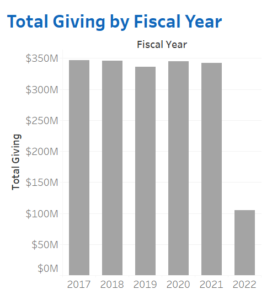
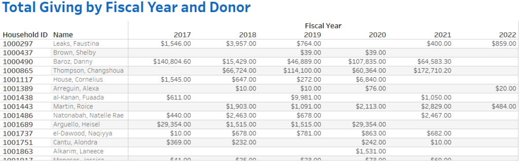
The bar chart quickly shows that most fiscal years have a total giving of just under $350 million dollars. The current fiscal year bar is significantly shorter than the rest, indicating that more fundraising (nearly $250 million) needs to happen before that target is hit. The spreadsheet, comparatively, takes much longer to parse.
Quickly Identify Trends and Outliers
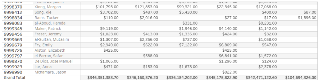
We have seen how data visualization can speed-up the path to insights. Data visualizations have additional benefits too. Trends in the data are easier to identify and contextualize with data visualizations. Let’s take a look at the chart below.
Here, we can see geographical areas where fundraising is underperforming relative to other US states. Washington, DC is over-performing in FY22 relative to the others, and Vermont has been volatile in its giving since 2019. From here, you can start digging into further questions, such as how fundraising campaigns may have differed in these geographical areas, did staffing changes have a particular impact, or explore if there are any prospects in these states whose capacity ratings indicate that there is untapped giving potential.
Another strength of data visualizations is that they make it much easier to identify outliers. Often, we are looking for the unusual when combing through a spreadsheet—the unusually large donation, the disproportionate number of comp tickets for a given performance. Those outliers are often where further investigation is needed or will prompt action, so being able to quickly find these situations will make your work more efficient.
For example, the chart below allows us to focus in on the broad-base of donors who have untapped giving potential based on their capacity ratings. It looks like we have some lower-dollar donors who can give nearly a million dollars with proper relationship building!
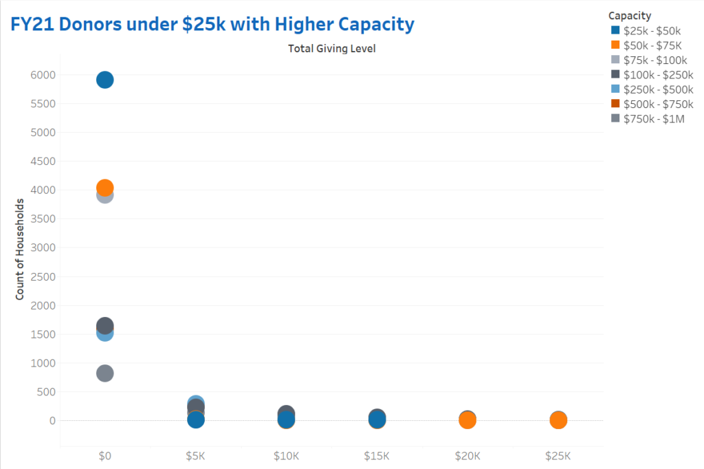
Narrowing in on those whose behavior does not match what we expect can help save people effort on qualification and cultivation.
Tools and Tips for Data Visualization
Data visualizations are often developed using business intelligence (BI) tools, such as Tableau, Power BI, Sisense, or using coding languages such as Python and R. The BI tools are particularly suited for connecting to your CRM, accounting software, ticketing databases, or your data warehouse. Connecting directly to the data with either a live connection or a frequently refreshed published extract can ensure that the decision-makers are using the same information (aka the same “source of truth”) and that the data reflects the current state of the organization. If you connect multiple databases to a BI tool (such as your fundraising data and alumni data), then you can enhance reports to bring in a more holistic view of your constituents and progress towards your mission.
One tactic for building out more data visualizations in your reporting is to take a key performance indicator (KPI) that your team relies on, and then start thinking about what additional context might be useful for better understanding that number. For example, if the number of tickets sold for tonight’s performance is a KPI, is that higher or lower than the number of tickets sold to the previous performance? How close is it to the budgeted goal capacity for that show? A line chart to accompany that KPI might help you better understand what that number means relative to other performances, but a bullet chart might be helpful in gauging how close to the budgeted goal that number is. Other places to start bringing in charts to your reporting can include the following:
- A line chart that shows the total value of contributions over the past 5 years
- A bar chart that shows the number of renewable memberships by the respective levels
- A heatmap showing which seats in a theater are purchased the most frequently throughout a season
- A stacked-bar chart showing the percent of gifts that come in through the Planned Giving team in a given fiscal year
- A polar area chart showing a count of event attendees by month
- A bullet chart showing fundraising progress to goals for different funds
There are often multiple ways to visualize data, so take this opportunity to evaluate what information is needed to make decisions, play with different chart types, and get feedback from your colleagues on how they interpret the results.
Turn Information Into Action
We are not expecting you, and particularly your finance teams, to give up on spreadsheets entirely. There is a time and place for showing information in a table. That said, significantly reducing the number of spreadsheets in reporting can help leaders yield insights from their organization’s data and make faster, data-driven decisions to support their missions. Spreadsheets in reporting expect the end-user to do the hard work of finding insights from the data, whereas data visualizations can point the end-user to the insight using cognitively efficient parts of the brain.
Concise, orderly CRM reports inspire strategic planning and energize campaigns for your organization. We’ll help you hone in on the right metrics, ensuring your CRM can always meet your specific demands.