RMA Feature Focus: Season Wrap-Up
Jennifer Nemeth
Manager, Professional Services
At the end of your season or fiscal year, are you using the RMA to its fullest potential to help you wrap up the season? Consider these reports that helps you see how your newly completed season compares to those that came before it.
Sales Trend Index
This report will show you the year-to-year trends for important KPI’s. How has your average yield changed over the last few years? What about average income per performance? The Sales Trend Index can tell you!
In your filters, select all performances in the last several seasons. Make sure to exclude any voucher, fake, or dummy performances, so that they don’t skew your numbers. The Sales Trend index will give you the % change in each KPI, using the first year you choose as the baseline at 100.
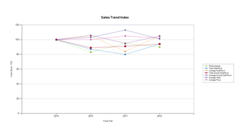
In the example above, we can see that Average Yield was particularly high in 2017, while Total Sold/Rsvd was rather low. On the other hand, when you compare the measures from 2016 to 2018, they look very steady. Add even more years to get a picture of your long-term trends.
Configurable Table Report
If you need to report on your dynamic pricing results for the year, the Configurable Table Report is a great way to pull all the numbers you need.
Filter for multiple seasons as we did above if you want to compare year-to-year. Or, just choose your most recent season, and you can compare production-to-production.
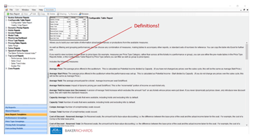
You have a big list of measures to choose from, so don’t worry if you’ve forgotten what some of them mean! The definitions are available for you to view anytime in the description pane of the report window.
The example below has some good summary measures for dynamic pricing, but there are many other measures that you can choose from, depending on what is most important to your organization.
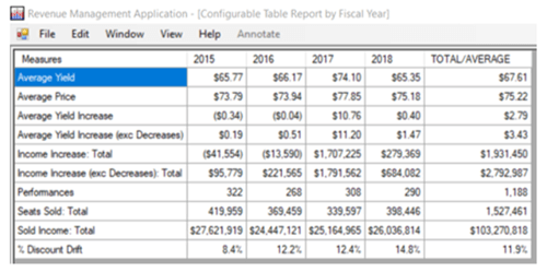
In this example we can see that we didn’t realize the same amount of money from dynamic pricing (Income Increase) in 2018 as we did in 2017. But, 2018 was still well above the amount of income from dynamic pricing that we made the years prior to 2017.
Our % Discount Drift was higher in 2018 compared to the previous years, which might be something we want to consider more closely. Did we offer more discounts than previous years? Or, did we push our top price to the point that more buyers chose a lower-priced seat? There could be many reasons for the change, but recognizing the difference is the first step towards uncovering the causes of it.
Dynamic Pricing Monitor
All of the numbers in the Configurable Table Report are useful, but if you’re looking for a visual way to see the effect of your pricing changes try the Dynamic Pricing Monitor. This report shows you the average sales (or income) sold at the starting price or at a changed price. It also displays your Average Price, Average Start Price, Average Yield, and Nominal Yield Variance, all in a visual format that make it easy to compare.
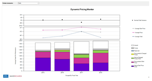
You can run this report over multiple seasons, as we’ve done with the reports above. Or, filter for just the most recent season, and group by production/production season to see how the shows in the season compare to one another.
I hope these reports give you all the data you need to help you wrap up your season!

