RMA Feature Focus: 3 Reports to Monitor Prices and Inventory

Andrew Moreau
Manager, Professional Services
I’ve Set Prices for the Season – What’s Next?
JCA Arts Marketing Director, Jamie Alexander, recently wrote an article on the importance of getting your prices right from the start and devoting the time to analyze past comparator performances to determine the most effective prices for your upcoming season. When prices are set properly early on, an organization will maximize value from inventory from the start. It is still essential, however, to monitor our seasons to make sure the original prices set are effective throughout the sales cycle.
In this article, we’ll discuss three reports that JCA Arts Marketing commonly uses with clients to track sales progress within a season.
Sales Curve
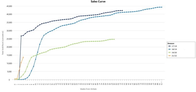
To start a sales monitoring exercise, the Sales Curve is a great way to see velocity of sales on a weekly basis. It is particularly helpful to display comparator performances against your upcoming production to understand how your sales measure up to the past. Anchoring your sales curve by Weeks from Onsale is useful to see how the on-sale performed, and anchoring to Weeks Before Performance is helpful to see how single ticket marketing campaigns are impacting sales velocity as you near the performances.
This report can serve as an eagle-eye view of how a performance or production run is performing, and it is an incredibly flexible tool—very user-friendly! Take a look at Senior Consultant and Analyst Jennifer Sowinski’s article with detailed instructions on the Sales Curve report—RMA Feature Focus: Sales Curve.
Weekly Wrap Report
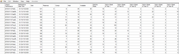
Now that we saw how performances are selling overall with the Sales Curve, let’s move to the Weekly Wrap Report to find velocity of sales for individual performances over the past weeks . We can use this report to quickly sort through performances to pinpoint which are selling ahead of the group, or if there are performances that might need more assistance by way of targeted discounts or promotions. When you are in the Single Ticket campaign, filtering out subscriber tickets helps you to gain a better picture of this demand without the noise of exchange tickets and other sales unrelated to your marketing efforts.
This report is in the form of a sortable spreadsheet. You can click the recent week columns to sort by the top earners of the set of performances in your report . Or, sort by the Available column to see what performances are running out of seats. Jot down the performances that you identify as needing further attention for the next step. As with any spreadsheet report from the RMA, you can also export this spreadsheet as an Excel file to share with your organization.
See another detailed how-to article on this report on our website—RMA Feature Focus: Weekly Wrap Report.
Configurable Monitoring Dashboard
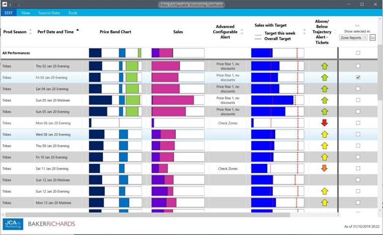
We have identified individual performances that might warrant a price change, a special promotion, or a further analysis of inventory, and now it is time to drill down further into sales by price band, price type, and zone with our Configurable Monitoring Dashboard. At first, this dashboard serves as a helpful tool to visualize inventory and sales for performances stacked against each other, with forty elements to choose from to include in your dashboard! From this report, you can also drill down into five sets of more detailed reports to guide you in your inventory and pricing decisions:
- Zone Reports are particularly helpful to understand the speed of sales, availability, types of tickets selling, and what is held on specific zones. Getting granular into speed of sales by zone helps you decide if you want a price change across the whole hall, or if only particular zones are moving, you’ll likely want to only re-price those sections.
- In-Season Model allows you to model a pricing change to see how it will impact your remaining financial capacity.
- Hotseat Index helps you understand sales progress on a seat-by-seat basis. This visual of your seat map can help you to identify sales trends across a run of performances in detail with a mirror view of your Tessitura seat map.
- Price History Report is a mirror of your Tessitura pricing grid and a reminder of what your current prices are, along with your pricing event history so far.
- Forecasting Module allows you jump right to the forecasting section of the RMA with your chosen performances automatically set as the filter! This is a quick way to adjust your forecast on a set of performances if, for example, sales are significantly down from your original forecast.
For detailed instructions on the Configurable Monitoring Dashboard, please visit our RMA documentation site.
Conclusion
These three reports are helpful additions to aide your ongoing pricing and inventory meetings, and establishing a routine in using them can be an efficient method to keep everyone on track and make data-driven decisions. JCA Arts Marketing supports many organizations with routine check-in meetings to do just that, and we would love to learn more about your current processes around sales and inventory monitoring. Please contact us if you are interested in learning more about how we can assist with effective monitoring and strategy.