
Best Practices for Creating Custom Reports


Kelly Cronin Krein
Data Analyst
If your existing CRM reports are not sufficient for your organization’s needs, you may need to pursue creating custom reports. While a bit more time intensive, custom reports provide more control over what information is presented, how it is presented, and ensures the information aligns with your organization’s business practices. To help you create reports people actually use, we’re providing some design and content tips for creating custom reports.
Keep the Report Design Simple
As in interior design, reports should have a focal point. A focal point is a primary image or text that then directs the eye from the most important information to the supporting information. In user experience (UX) design, this is often called the visual or information hierarchy. It is difficult to create focal points with too much data on a single report that are the same font, size, weight, and colors. Incorporating visual hierarchy principles allows the report writer more control over the user experience than if they present everything uniformly. A focal point allows you to highlight key information and tell the “story” you are looking to convey.
How can you use visual hierarchy principles in your reports? Key Performance Indicators (KPI’s) and charts often are placed at the top of the report, with the most important value either in the center by itself or to the left so it is the first value read. Note that this left-focused advice is geared towards users who primarily use English and other languages that are read left to right, top to bottom, and may need to be adapted if the audience for a report uses a language that flows in a different direction. Use large font sizes with these important numbers and color or symbols to indicate whether the value is good or bad.
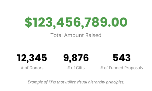
Parts of the report that break out what contributed to those KPI’s are generally placed below in a smaller font, perhaps using color to call out what had the largest influence on the primary KPI. For example, you may have a KPI for number of tickets sold in a season, and below that you may have a bar chart that shows number of tickets sold per production and use color to highlight the top five (5) selling performances.
With visual hierarchy in-mind, let us turn our attention to what data should be included in the custom report.
Show Information that is Important to the Report User
Each report should clearly and effectively communicate a small handful of insights. A single report should not be responsible for communicating everything to all levels of the team. Remember, reports augment your CRM, they do not replace your CRM. This relates to having a clear objective and audience for the report, but it is also practical. The human brain can only process so much information at one time!
Too much data shown in a report can make it difficult for a particular user to know what is important to them and their supervisor. Which metrics should you be focusing on each time you see this report? These should be prominently placed and styled so they are the first thing the eye goes to when you open the report. If you make the user work too hard to find the important information, they will lose motivation to use the report.
To that end, only show information that is useful, effective, or actionable. If a number is representing something that is not one of your metrics of success or does not drive progress towards your organizational goals, it is not useful to include in a report. Keep in mind that the information that is useful to one team may be different than another.
For example, reporting on the average shoe size of your ticket buyers is not necessarily going to help you meet this season’s sales goals! Reporting on that information is not useful. On the other hand, reporting on the number of subscribers who attended a performance could help you understand the health of your subscriber program and your key supporter’s tastes.
Provide Context to Your Numbers
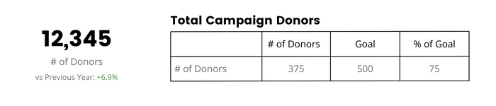
Context provides anchoring to the values shown in a report and allows the user to understand whether the number is good or not. This could mean comparing a number to a goal value established by your department leadership, to last year’s numbers, or data from others in a similar role. Numbers without context can be confusing.
For example, depending on the size of your organization, raising $500,000 this fiscal year may be a resounding success or an abject failure. Did you just start the fiscal year, or is it coming to a close? Is your goal $600,000 or $5M? Don’t assume that the user knows all of this context innately—include context information in your reporting.
This could look like adding a note below a KPI about how this number compares to last fiscal year, or including your goal values and a “% of goal field” to your tables.
Create Effective and Clear Custom Reports
Concise, orderly CRM reports inspire strategic planning and energize your organization. Our experts can help you design a customized solution with capabilities beyond what your vendor can provide.
If you need help customizing your reports or guidance on how to get the most out of existing materials, we are happy to help!